Tuesday, August 30, 2011

Project 4: Hawaiian Sea Turtle Doodlebug Layout

Today is the day! My Doodlebug Design Team application is due. Wish me luck! I stayed up late working on my final project, this double page layout. My mom and I went to Hawaii for vacation last year, but I'm still playing scrapbook catch up, so I hadn't touched these photos. I did however, purchase these Doodlebug Sealife stickers and papers awhile ago and decided to save them to scrapbook my amazing sea turtle photos. I knew these adorable Doodlebug designs were perfect for my absolute favorite photos. Last night my local photo developer asked me for permission to blow up a poster-size photo of the turtle and me to display in their shop. :) Here is a look at the "Tashina and the Turtle" layout: 
Here is the first page. I love how the papers are so bright and cheery. The yellow mat is from the Doodlebug Welcome Home Collection: 
Aren't those glittery sea animals adorable?! I raised them on pop dots: 
I had been saving these tiny turtle Doodlebug boutique brads for these photos specifically:
Here is a look at the second page!
Shhh...here is a little secret. The only tags I have in my stash that matched my color scheme were from the Doodlebug Welcome Home Collection, but who places a couch in the middle of the ocean? I mounted a glittery octopus on white cards stock and...
Viola! Couch-at-sea problem solved! 
I am IN LOVE with this baby turtle! My only hope is that Doodlebug comes out with another beach/Hawaiian line because I'm going to Hawaii again in two weeks for my birthday! This time with a group of five friends. Please give us more stickers and lovely papers! Maybe with little hula girls this time? :)
I hope you enjoyed my projects. They were so fun to make and applying for the Doodlebug Design Team has forced me to use some of the papers I had been saving! Awesome!

Love,
Tashina

Monday, August 29, 2011

Project 3: Barnyard Love Doodlebug Album

Here is my third project for my Doodlebug Design Team application! I love the way this mini album turned out! It took FOREVER, I think the final result was worth it! :)
I titled the album "Barnyard Love." Here is the cover. Isn't the Doodlebug metal bluebird brad adorable? I covered the tabs in Doodlebug paper:
The next pages say: "Cock-a-doodle-doo! I love you!" and "You're tweet." I inked almost everything in this album including all of the photo mats:
I loved how the grass turned out! I cut one of the green checkered Doodlebug border stickers: 
I think this is my favorite page in the whole album. It says, "I'm udderly in love with moo!" The tiny lady bug is the cutest:
The next page says, "You're berry special to me." This page also has a tiny strawberry Doodlebug boutique brad with a green rhinestone: 
This page says, "Hogs and Kisses!" The hearts and sun were cut from the Cricut Doodlecharm Cartridge that was designed by Doodlebug founder, Cynthea Sandoval. *I think that the lipstick kiss stamp is the only non-Doodlebug product in the album: 
I mounted most of the stickers on white card stock and used pop dots to add dimension to the entire album: 
This page says, "You make my heart giddy up!" Aren't the horseshoes perfect for the theme? And I love the tiny mouse holding the piece of cheese! Doodlebug makes the best products ever!
This one says, "I love ewe!" The yellow chicks are so tiny! The green Doodlebug paper with yellow flowers was perfect to make rolling hills:
I added tiny silver Doodlebug brads to the tractor wheels: 
I think this is the most creative page. "Why did the chicken cross the road?" Answer: "To tell you she loves you!"
The eggs with the little running legs fit perfectly with this theme. 
The rooster and hen have a baby on the way. Notice the tiny egg between them: 
The next page has a puppy theme and says, "I ruff you!" The brown Doodlebug brads have felt on them: 
The last page in the album has a spot for a love letter with an envelope and itty bitty card that I decorated to match the barnyard love theme: 
And of course I lined the inside of the envelope with matching barnyard paper: 
Love,
Sheenie

I used the Doodlebug Barnyard Collection, Doodlebug Jack & Jill Letter Stickers, Doodlebug Welcome Home Collection, Doodlebug Great Getaways Collection, Doodlebug On the Go Collection, Doodlebug Plain and Simple Chipboard album and the Doodlebug Go To Sketches Card Companion Kit.

Friday, August 26, 2011

Project 2: You Brighten My Day Doodlebug Card

I have another Doodlebug design team submission for you this morning using the Doodlebug Create-A-Card and Tutti Frutti lines. Here is a view of the entire project:  
Here's a close up of the card front. I just love the glittery strawberry and baby blue bird! I also thought the twine bow added a delicate touch: 
Here is a view of the inside of the card! Everything sparkles in the sun with glitter. :)
I lined the inside of the envelope with that gorgeous strawberry print paper: 
A view of the envelope seal: 
I added a tiny mushroom sticker to the front of the envelope: 
One last view of the project: 
Have a wonderful weekend! I am praying for the families on the east coast with all of the scary weather you are experiencing. 

Love,
Sheenie

Thursday, August 25, 2011

The Lovely Scenes: Double Page Layout

I have another double page layout for you. Right now, I'm working on an album of college memories and I'm documenting my travels abroad. So most of my posts for the next little while will be internationally themed. Here is a look at the whole layout. I used older Doodlebug and Making Memories products:
I placed three photos in a collage formation directly on my Cricut mat and used the center point function to cut a circle around the photos: 
So I didn't have the best camera as a college student and these pictures were taken eight years ago with a traditional film camera. A friend suggested that I scan the prints, alter them in Photoshop and reprint before scrapbooking. If did that I would never catch up! Plus I think photos taken in 2003 should reflect the year they were taken. :) And they're my memories, so that's what's important right? 

I just adore these glittery flowers from Doodlebug. I added buttons to the center and then a rhinestone in the middle. 
Here is a look at the second page. These photos were taken at Humayun's Tomb in India: 
I love the added rhinestones to the date: 
Love,
Tashina

Wednesday, August 24, 2011

Foothills of the Himalayas: Double Page Layout

This is one of the layouts that I completed over the weekend. Here is a look at the whole layout. I love the quote: "The wise man travels to discover himself." I wanted this layout to have a simple, natural and clean look. 
I used some of my scrap paper to add colored circles, cut from a circle punch to the layout. The beautiful tree was cut from the Cricut Heritage cartridge: 
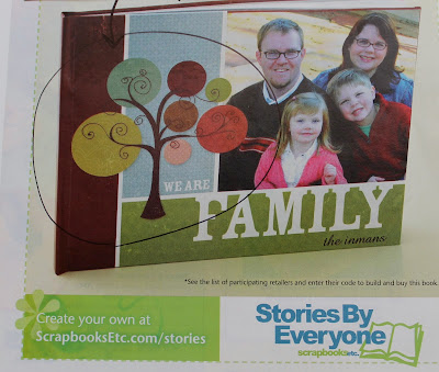
I scrap lifted the idea for the tree from an ad that I saw in an ad in ScrapbooksEtc. magazine: 
Here's a look at the second page, pretty simple but classic: 
As I'm posting this, I realized that I forgot to add an important element that I place on all of my personal scrapbooks--the year! Here are a few rules that I use: first, unless the page is at the front or back of the album, all of my personal scrapbooks are filled with double page layouts. Second, I always place the year that the pictures were taken on the page. Finally, I sign and date each layout with the year that I scrapbooked the page next to my name. This way I can track my work and see how my style changes overtime. :) 

Tuesday, August 23, 2011

Project 1: Doodlebug Christmas Card

Hi friends! The application for the first ever Doodlebug design team is due in a week and I've been busy working on my projects. We have to submit two cards, a layout and a three-dimensional project. I may or may not have stayed up until 4:30am on Saturday night watching back to back episodes of 24 on Netflix while crafting away completely oblivious to the time.... Oopsie. Anyway--here is my first project! I hope that you enjoy it!

Here is a view of the front of the card. I love this striped Doodlebug paper. It reminds me of a candy cane! I cut a thin strip to look like a ribbon, and used a circle punch to make a circle slightly larger than the Santa sticker: 
I lined the envelope with the playful candy cane paper to match: 
Doodlebug came out with this fantastic create-a-card concept. There is an assortment of cards and envelopes in all shapes and colors that you can mix and match. What a novel idea! I picked up a gorgeous tri-folding raspberry colored card and matching envelope at my local scrapbooking store. The cards are displayed like this:  
Here is a view of the first fold of the card:
I lined the inside of the card. I love the little gingerbread, stockings and cups of hot cocoa on the paper!
A close up of the middle of the card. The sparkly snowman is the cutest: 
I decorated the back of the envelope with snowflakes:
And the front of the card with a present: 
Here is one last view of the card. I used pop dots to add dimension to the Santa: