This is one of the layouts that I completed over the weekend. Here is a look at the whole layout. I love the quote: "The wise man travels to discover himself." I wanted this layout to have a simple, natural and clean look.
I used some of my scrap paper to add colored circles, cut from a circle punch to the layout. The beautiful tree was cut from the Cricut Heritage cartridge:
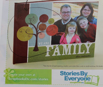
I scrap lifted the idea for the tree from an ad that I saw in an ad in ScrapbooksEtc. magazine:
Here's a look at the second page, pretty simple but classic:
As I'm posting this, I realized that I forgot to add an important element that I place on all of my personal scrapbooks--the year! Here are a few rules that I use: first, unless the page is at the front or back of the album, all of my personal scrapbooks are filled with double page layouts. Second, I always place the year that the pictures were taken on the page. Finally, I sign and date each layout with the year that I scrapbooked the page next to my name. This way I can track my work and see how my style changes overtime. :)


No comments:
Post a Comment